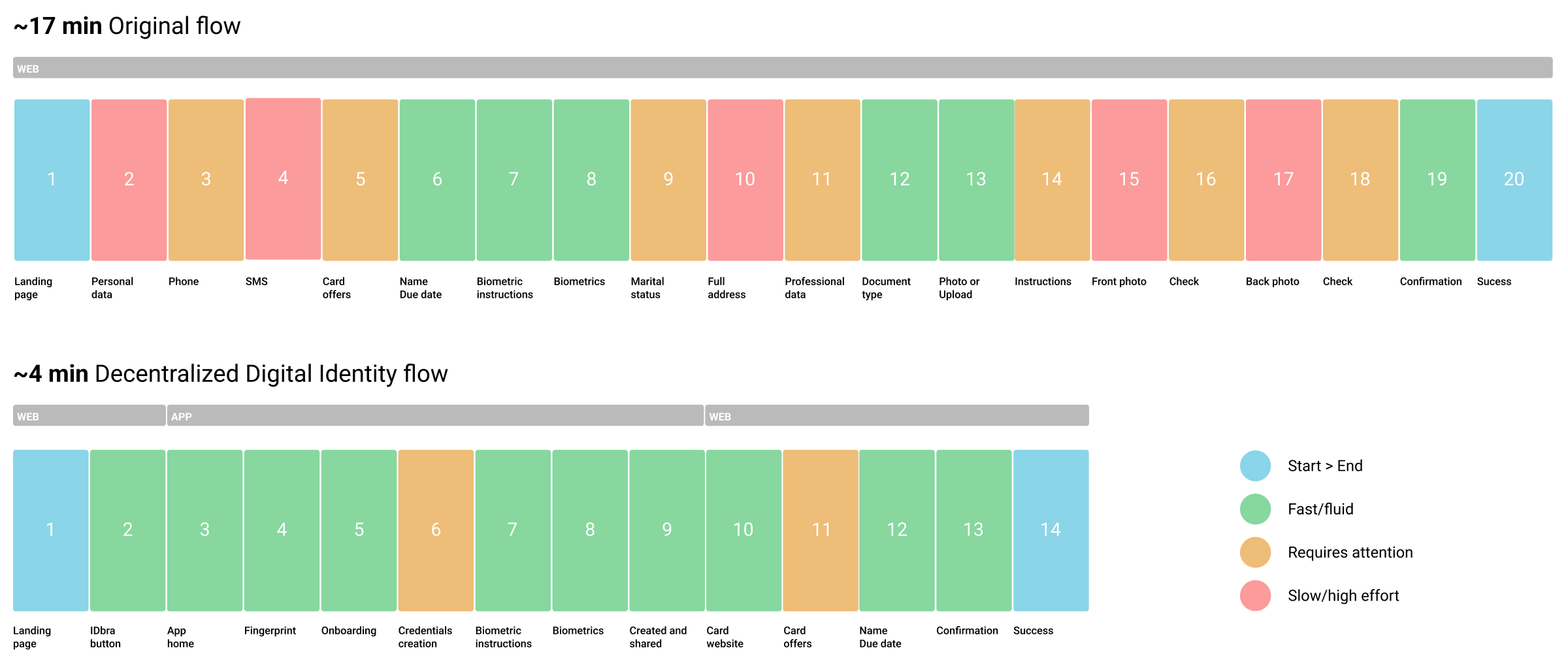
Reducing credit card acquisition time by over 75% through Decentralized Digital Identity

Even existing bank customers had to refill all personal data to apply for a credit card —
despite already verified. I redesigned the journey using digital credentials to reduce
the process from 17 to 4 minutes.

Overview

Problem

Customers faced a fragmented onboarding. Legacy bank clients had to manually re-enter personal data and re-upload documents on a separate credit card portal. This friction resulted in a 17-minute application process with high drop-off rates (over 80% of applicants).

Solution

Transform verified bank data into Digital Credentials. Users authenticate via facial biometrics in the bank’s app and instantly export verified attributes to the credit portal—reducing application time to 4 minutes.

My role

Product Designer responsible for designing the credential issuance and management flows. I led all design phases, facilitated daily design critiques, and managed the complete design delivery including the mid-project migration from Adobe XD to Figma (350+ screens redesigned).

Entry point

Post-Discovery Phase — I joined after initial research and concept validation to transform the solution into a production-ready product.

Solution concept

Transforming a concept into a testable design

The concept of Digital Credentials was already defined by the business.

My design challenge: make users understand and trust sharing their verified data.

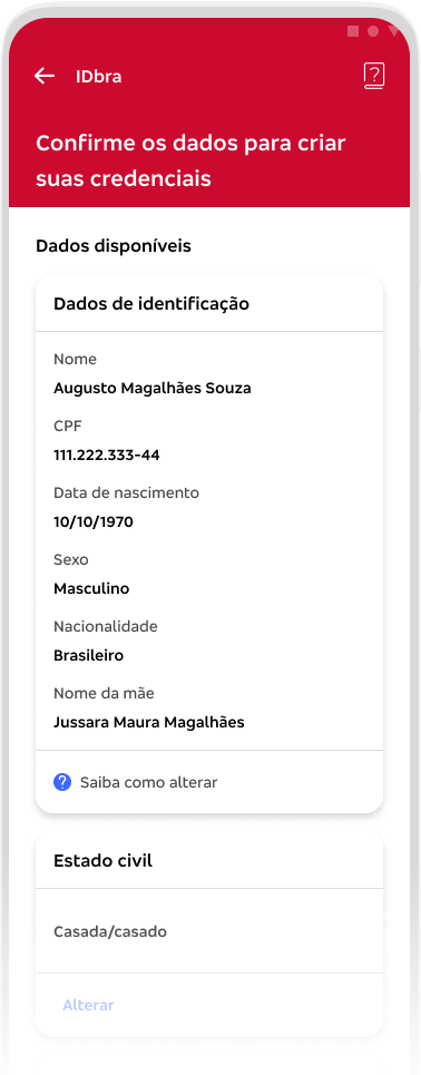
I created a navigable prototype in Adobe XD that tested this approach—showing all credential data upfront, letting users review before confirming.

This prototype became the foundation for research validation.

Screens:

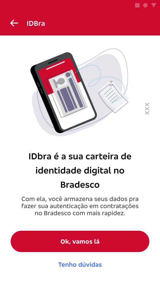
  1. Entry point: Credit card landing page
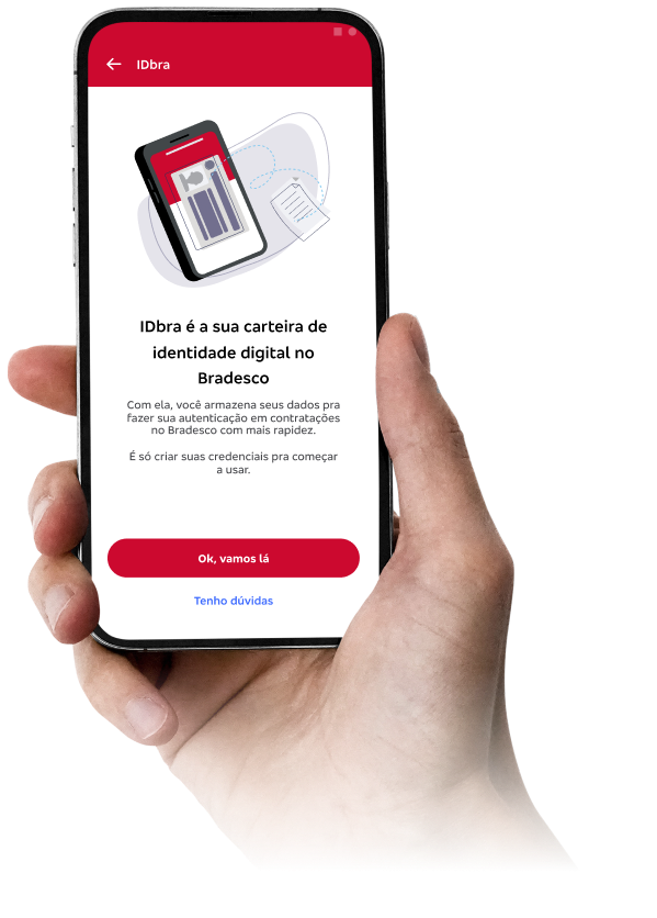
  2. Bank app onboarding
  3. Review credential offers: All data required
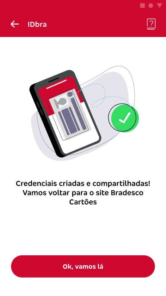
  4. Success in creating and sharing
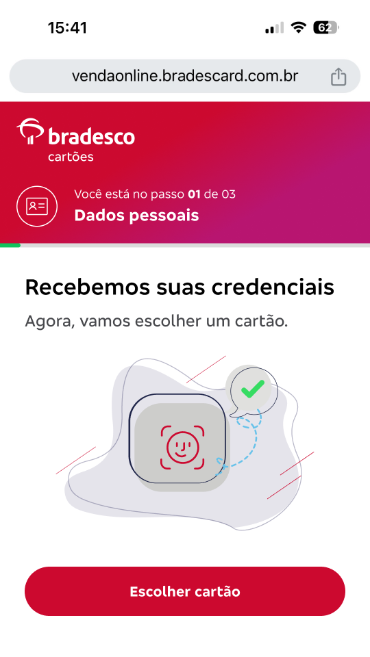
  5. Back to credit card portal: Credentials received

Research

To validate the proposed digital identity solution and understand how users navigate the experience, we conducted an exploratory qualitative study.

We interviewed eight participants who had recently applied for a credit card through the bank’s website. Each session lasted approximately 60 minutes and followed a semi-structured interview script that explored user expectations, navigation patterns and perceived value of the new flow.

7

Customers who had completed the original workflow

Value

Focus on perception, not usability

Methodology

Exploratory qualitative research

Participants observed the facilitator navigating the prototype while providing instructions, reactions and feedback throughout the session. This moderated walkthrough helped us uncover friction points, misunderstandings and opportunities to improve the overall flow.

Research validation revealed which interface patterns resonated with users

Key user pain points

The research revealed several friction points in the existing card application process:

Long and repetitive forms
Users reported frustration with the number of required fields. Completing the full form often took more than 10 minutes, increasing irritation and the likelihood of abandoning the process.

Authentication failures
When biometric verification failed, users felt uncomfortable and uncertain about the process. In many cases this interruption led them to abandon the application.

Loss of entered data
Participants described situations where the page refreshed unexpectedly and all previously entered information was lost, forcing them to restart the process.

Date selection difficulties
The calendar component made it difficult to select specific dates, particularly when navigating across years.
These findings reinforced the need to reduce form friction and streamline identity verification through reusable digital credentials.

Design

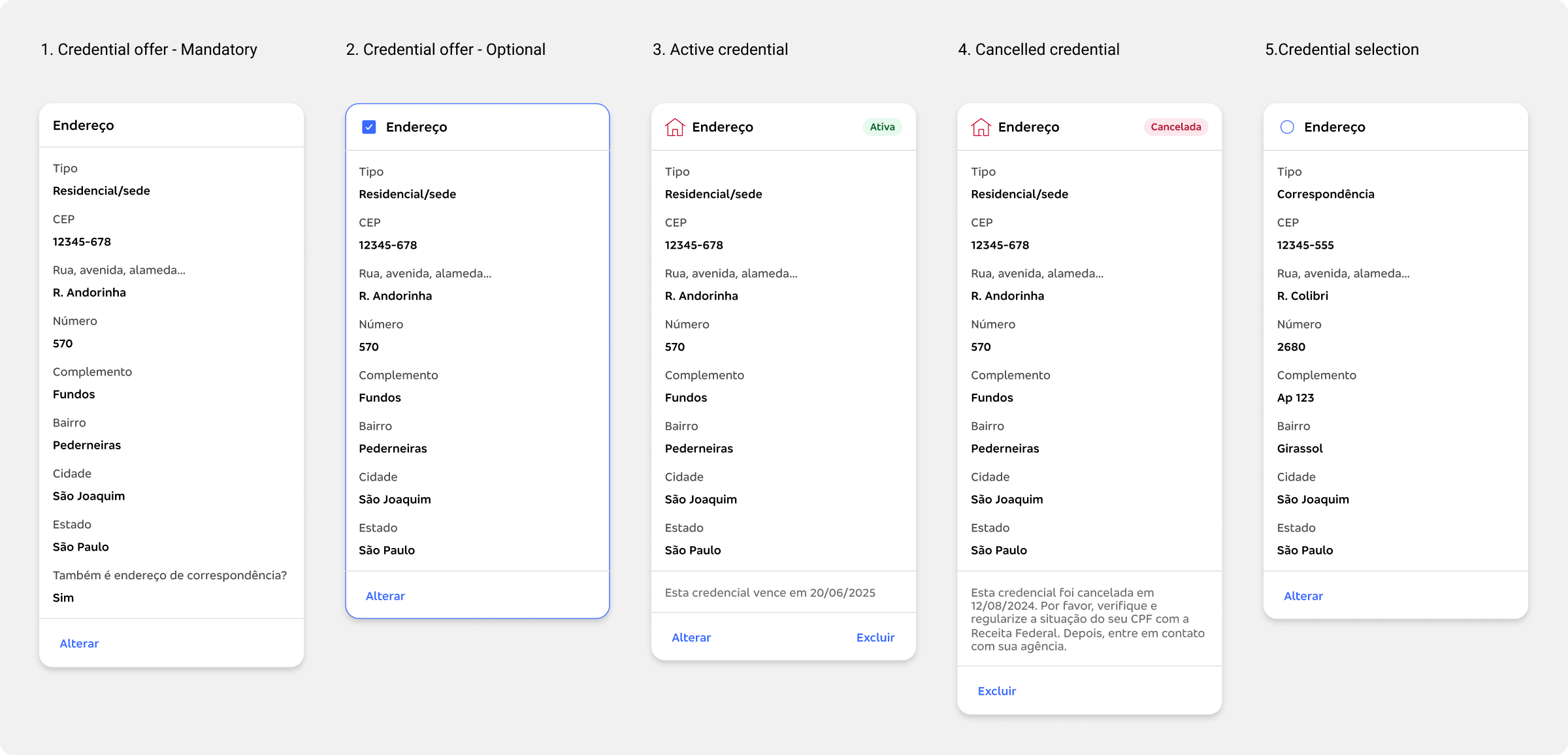
Design system strategy: 80/20 approach

“During the design phase, the bank migrated from Adobe XD to Figma. Rather than treating this as a setback, I used it as an opportunity to restructure over 480 screens and multiple flows, improving component organization and Design System alignment before launch.”

I identified that 20% of the components used solved 80% of users’ data visualization problems. This modular approach reduced visual complexity while maintaining the information hierarchy across different credential levels, enabling faster development cycles.

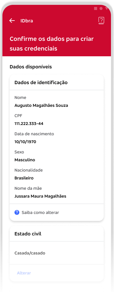
1. Credential offer – Mandatory
Creation and sharing flow

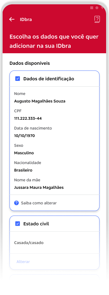
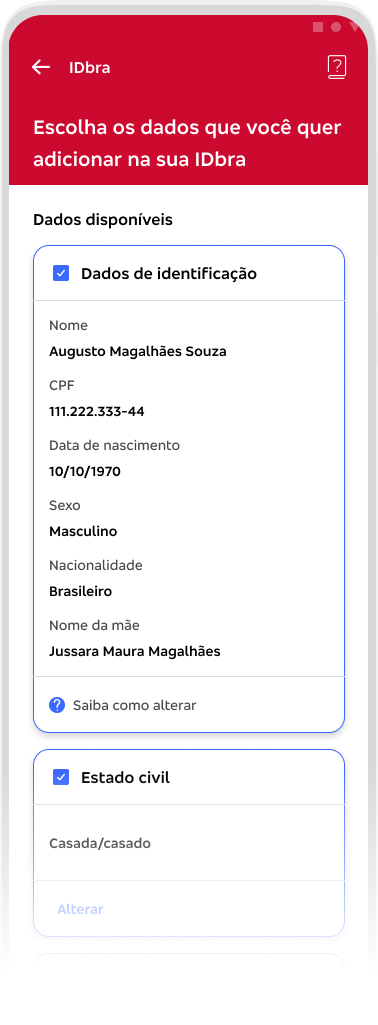
2. Credential offer – Optional
Creation flow

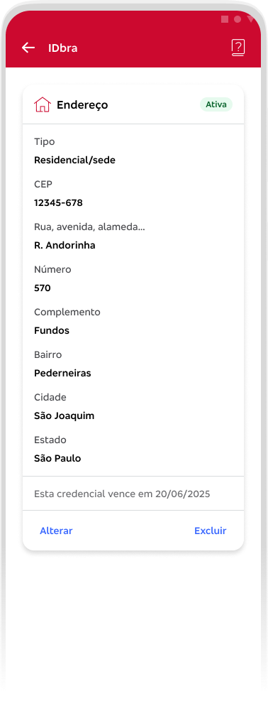
3. Active credential
– Viewing flow of created credentials
– Sharing flow – cards/data are mandatory

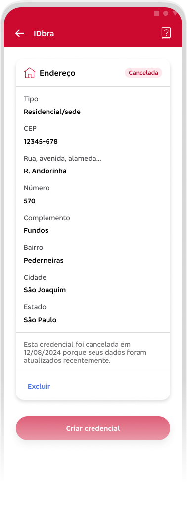
4. Cancelled credential
Viewing flow of credentials cancelled due to expiration date or other business rule

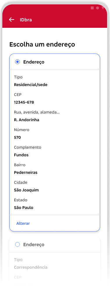
5. Credential selection
Sharing flow when one or more credentials are available – the user chooses which one to use, which can be an offer or an active credential.

During the design phase, the bank migrated from Adobe XD to Figma. Rather than treating this as a setback, I used it as an opportunity to restructure over 350 screens and multiple flows, improving component organization and Design System alignment before launch.

A powerful database update tool

To prioritize data transparency, we bypassed accordion components in favor of an expanded layout. Although this increases vertical scrolling, it ensures all registration data remains fully visible and accessible to the user during the process of creating or sharing credentials.

The credential card became the core component — 20% of screens, 80% of functionality

Impact

Impact

AVERAGE TIME

-76%

17 > 4 min

PREDICTED ADOPTION

4x

Conversion

MVP IN PRODUCTION

2025

+40k customers

2026

+25M

customers

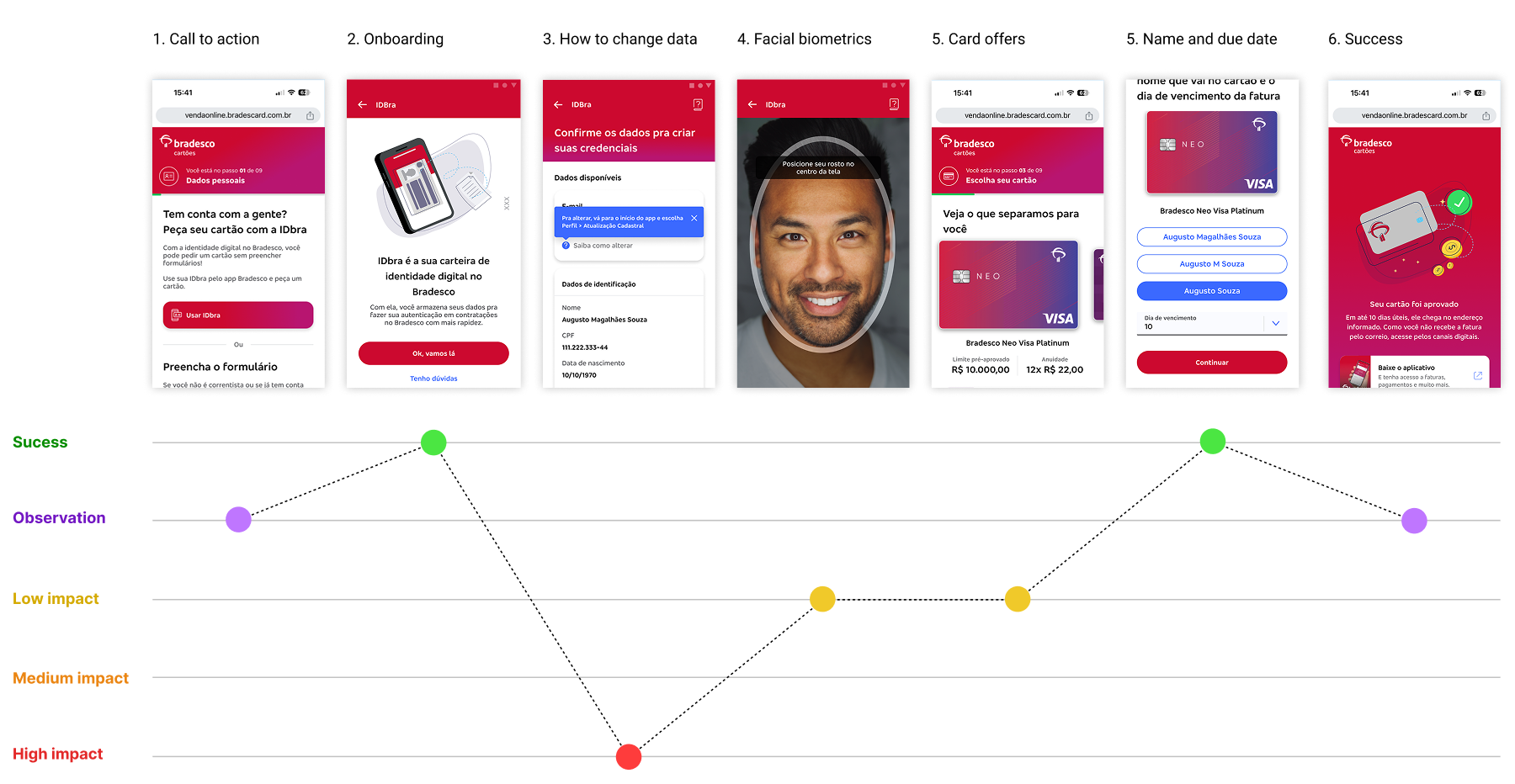
This comparison shows the friction points in the original 17-minute flow versus the streamlined 4-minute DDI flow