Mobile First E-commerce
Challenge: Create an interface for people unfamiliar with digital interfaces that was easy to use and met business requirements.
![]()
2017 | PRODUCT, UX and UI DESIGN
Wirefames
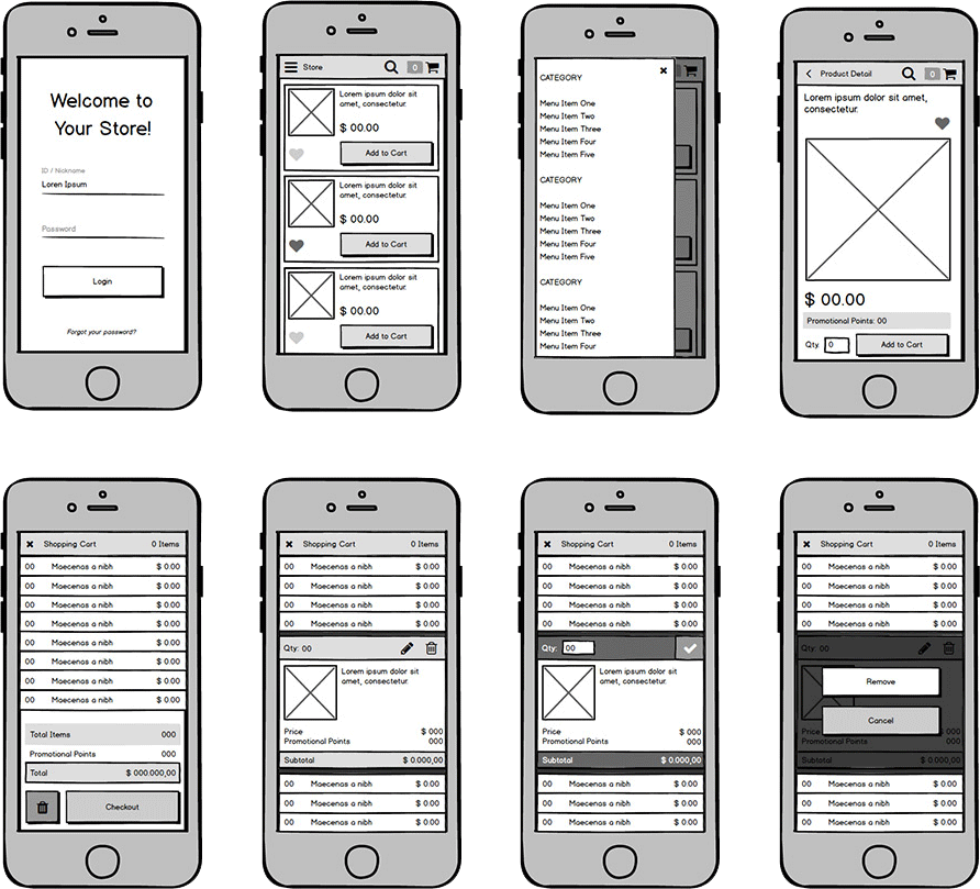
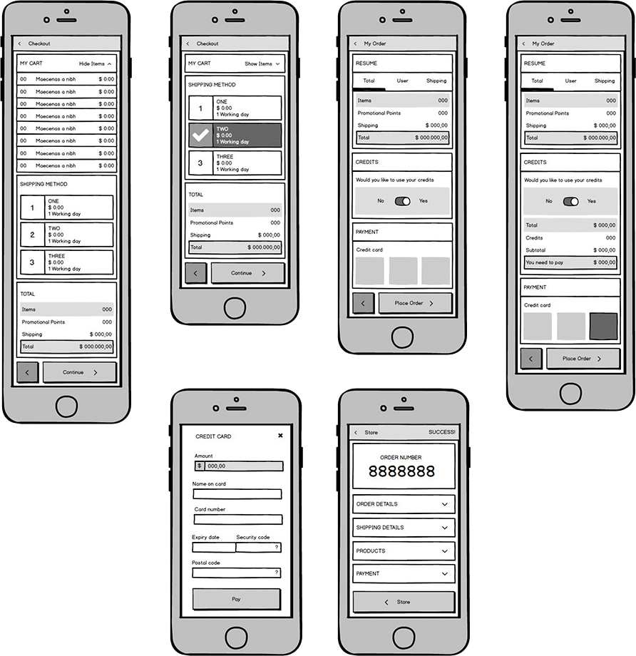
This store has restricted access and It´s so simple to use – the reason are the users, people that doesn´t have much experience with digital interfaces. I created these navigable wireframes with Balsamiq to discover and refine the best ways to make buying and payment processes more easy and intuitive.
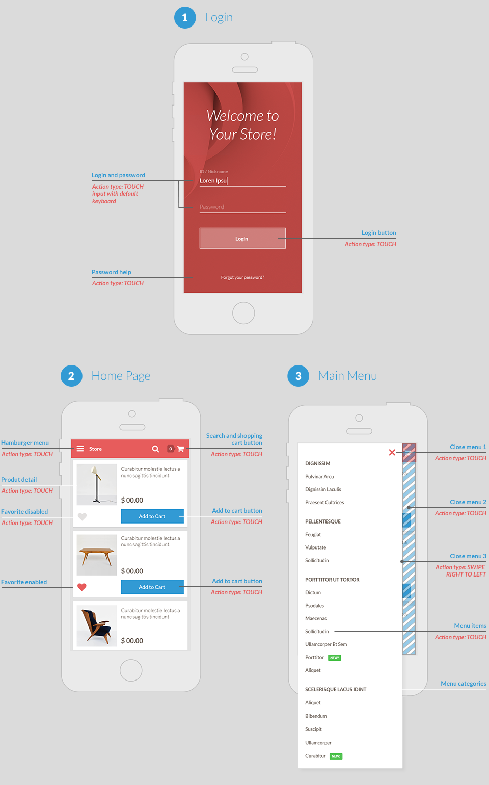
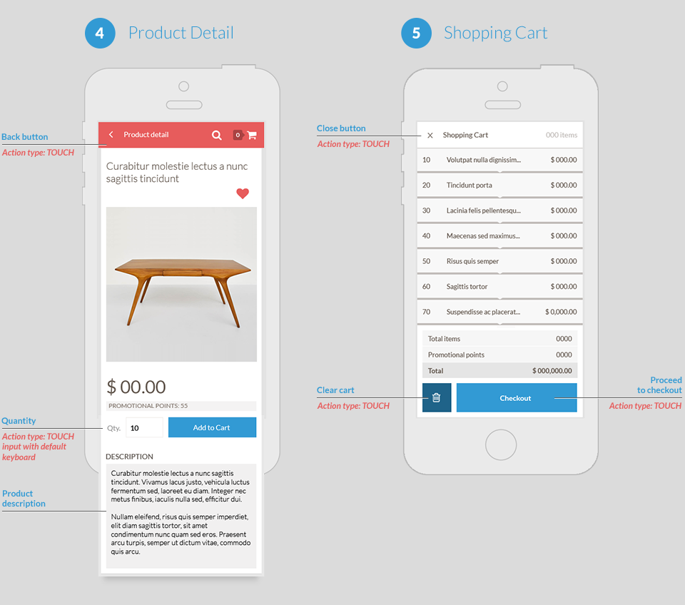
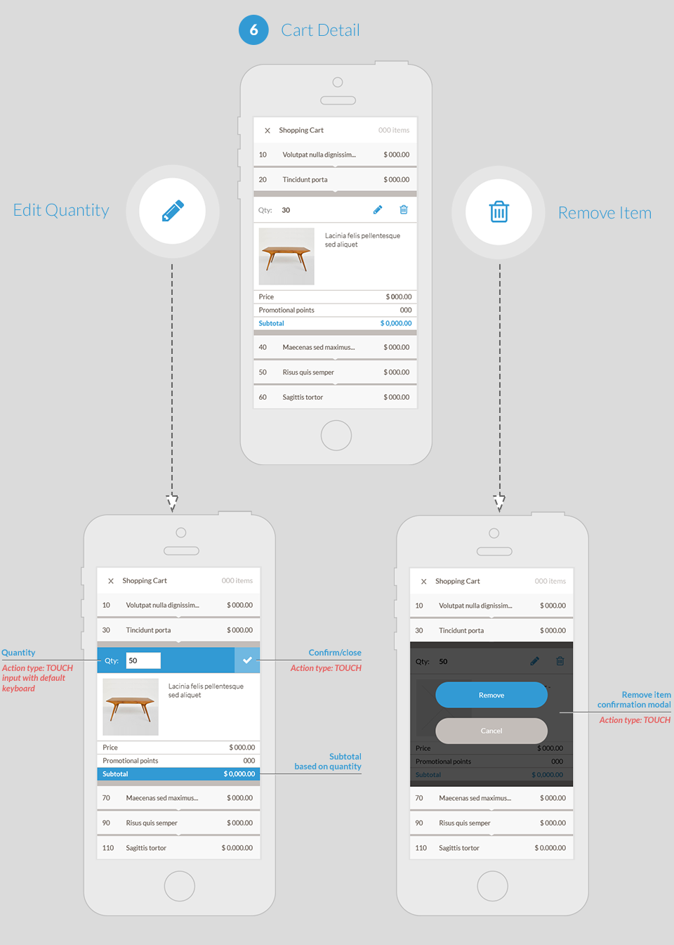
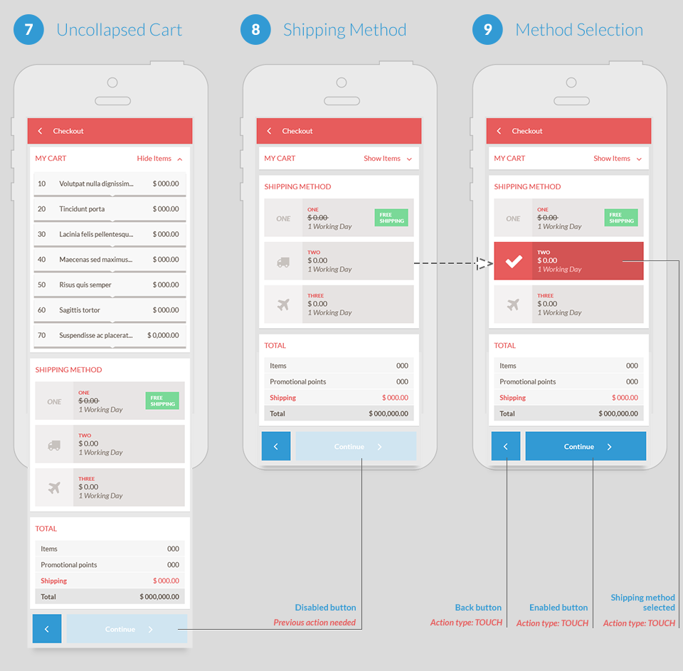
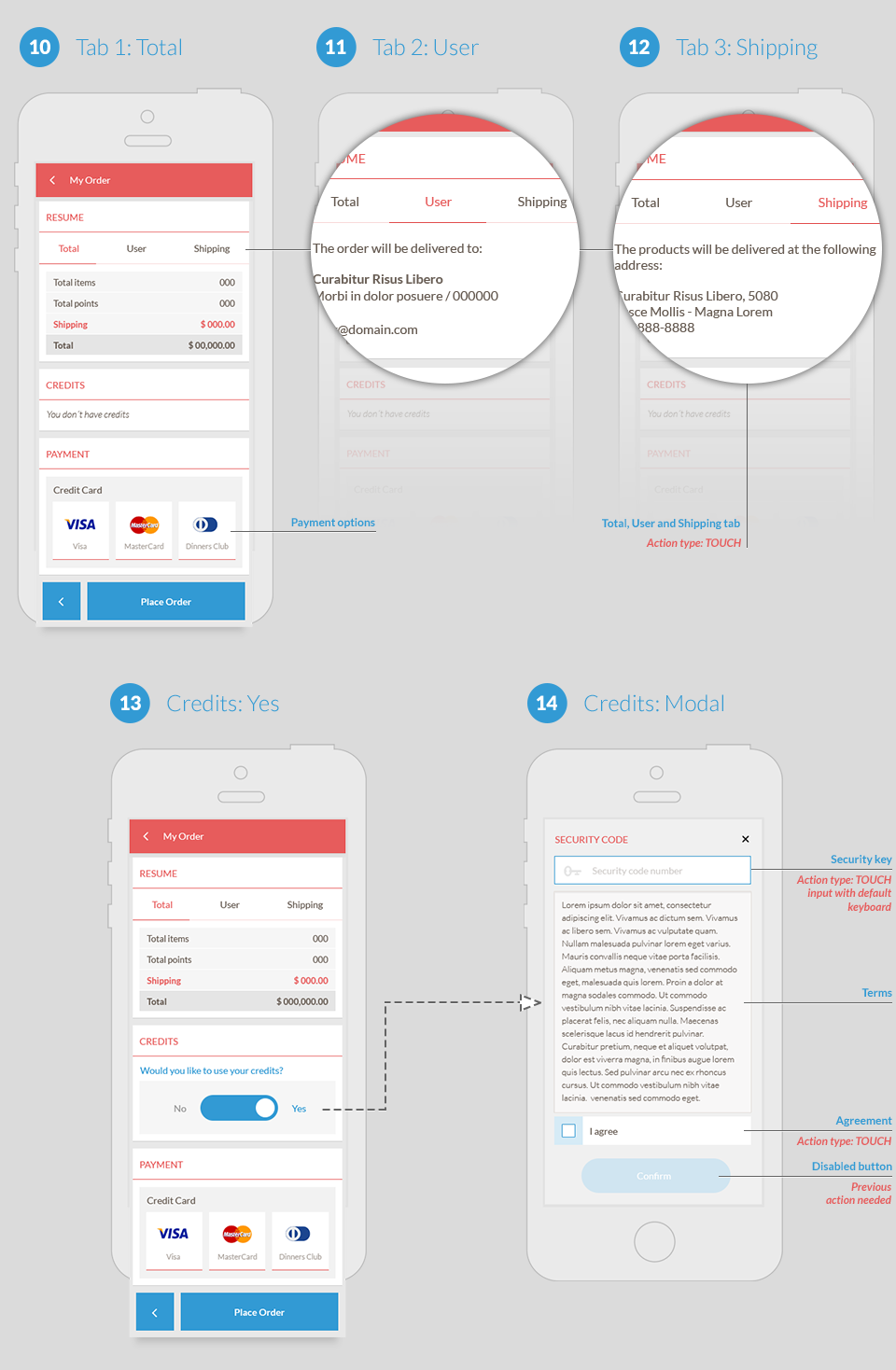
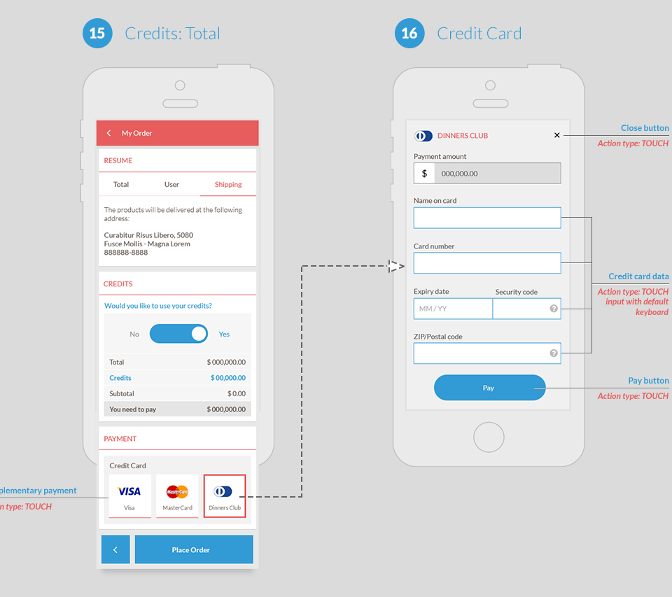
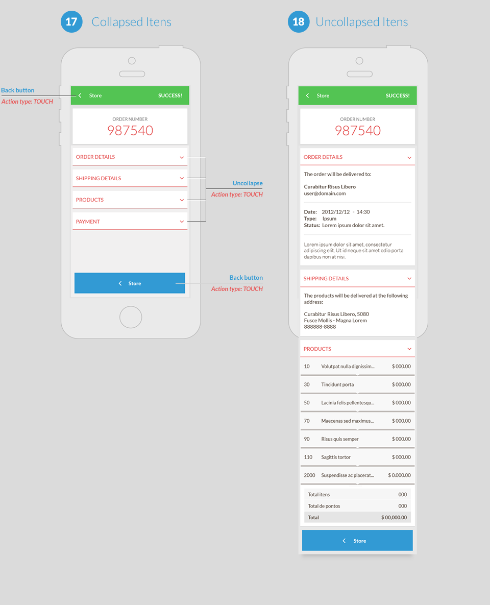
High Fidelity Wireframes
I created these high fidelity wireframes to fill in the details that are missing in the low fidelity ones because they show more details, gives a better taste of what real UI elements might look like and they also make it easier to communicate functionality to engineers.
