Carreira Play
The symbol is a large letter C with a central play icon. The graphics formed by 3/4 of a circle represents the letter C of Career and the external circular lines cheerful and colorful represent the diversity of segments and areas of companies that will disclose their content on the video platform. Motion design and identity manual:

Cyclops
INPE - National Institute For Space Research - Brazil - The logo for the Cyclops (Cyclotron Emission of Polars) project was based on the diagram used in the Polar Project calculations and refers to the mythological Cyclops. The elements form an eye through the junction of two curved graphs representing the flow of matter.

Visa Waiver Now
Braztoa - Brazilian Tour Operators Association - Visa Waiver Now was a coordinated initiative of BRAZTOA, to inform and mobilize professionals and consumers about the benefits of visa flexibility for Brazilian and North American tourists.


BETRACE
The main characteristic of this project is to show, above all, safety. The main shape of the logo is a road warning sign. The center circle represents a vehicle. The waves around represents an electronic fence and the total protection that the service offers.
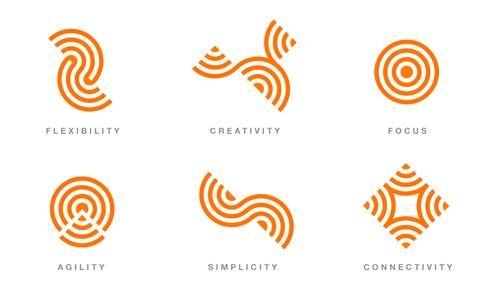
From the waves, graphics were created to represent the pillars of the company: Flexibility, creativity, focus, agility, simplicity and connectivity.
