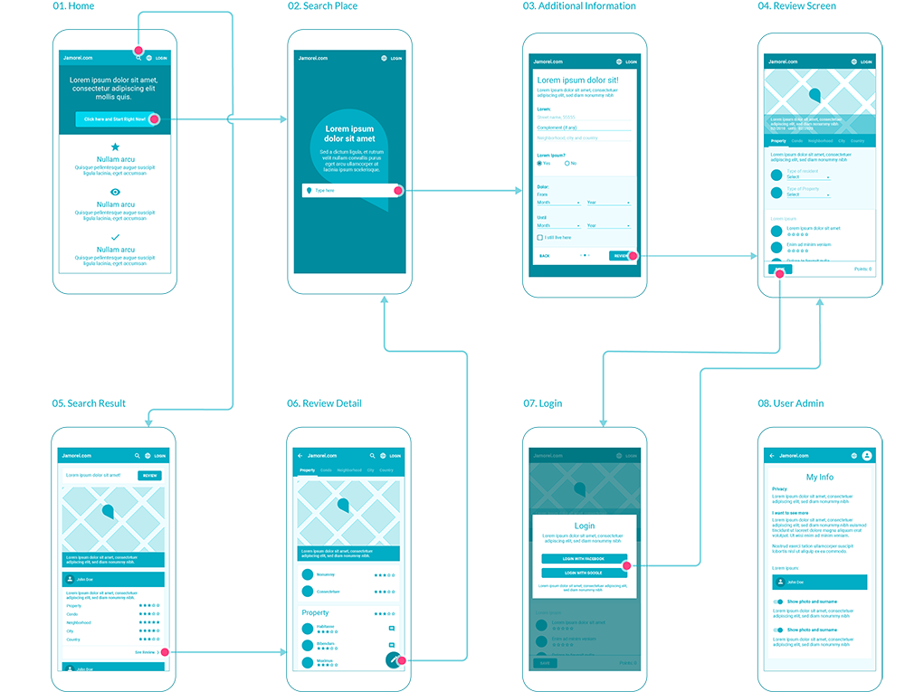
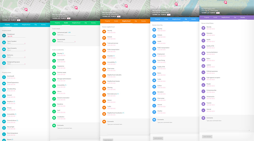
Wireflow
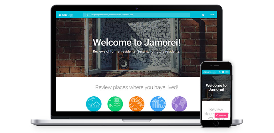
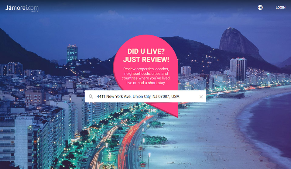
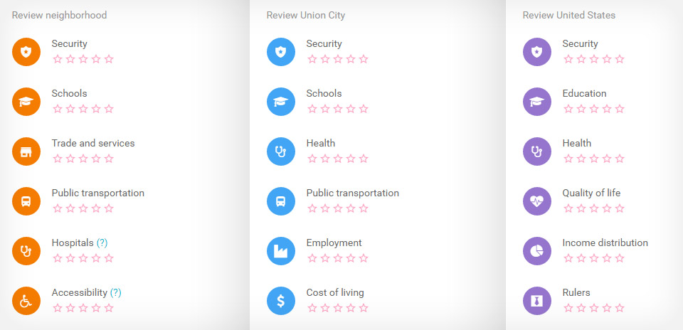
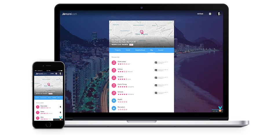
This side project was launched in 2014 and it was completely redesigned, with new features, in 2016. Fully responsive and with a new design based on material design, in addition to properties, it is also possible to review condos, neighborhoods, cities and countries from any part of the world.
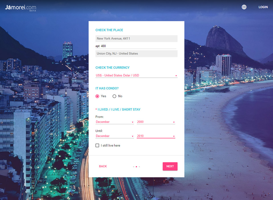
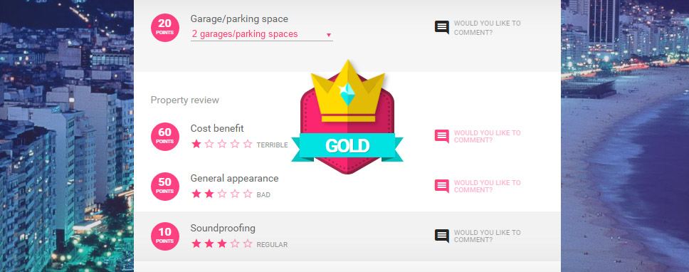
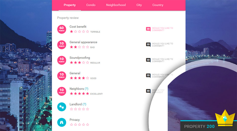
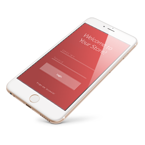
The registration flow was one of the most important issue. In the first version of the project, the user could only fill the review form after logging into the system, which resulted in many registrations but few reviews. In this second version, the process is transparent. The user can make reviews without registering. If you like the experience, you'll save the review - and sign up :)
