Keep me informed
A constant complaint from users was that the system was constantly changing and these changes were not communicated clearly.
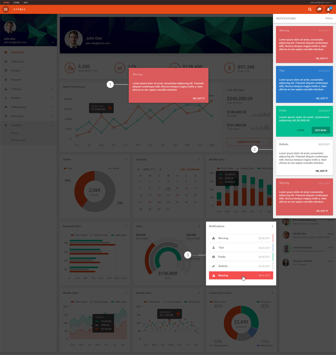
The solution was to create three ways to display notifications to ensure that the user was kept informed:
First: A modal with the most important communications. The modal is also triggered when the user clicks on any item in the "Notifications" card.
Second: Insertion of a bell icon located on the top bar, which also shows the amount of notifications that have not yet been seen. Clicking the icon opens a flyout with the last five notifications.
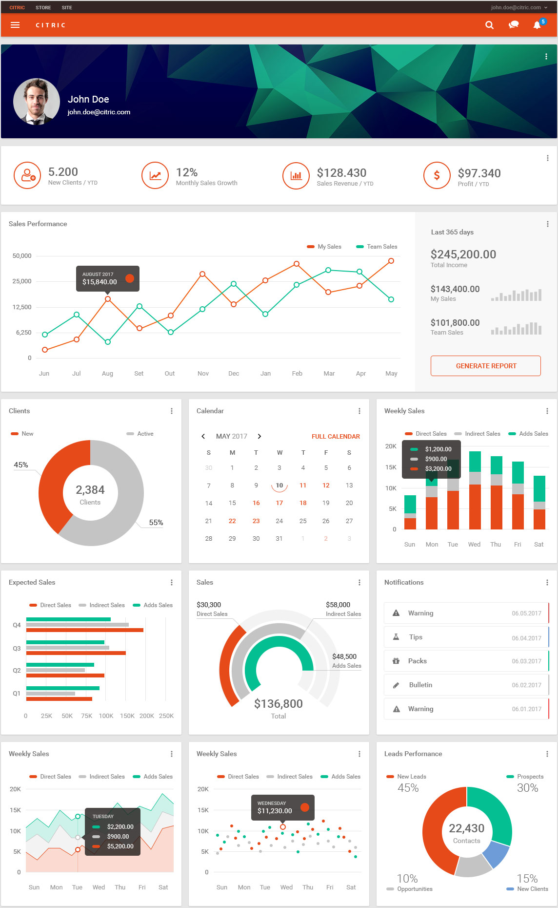
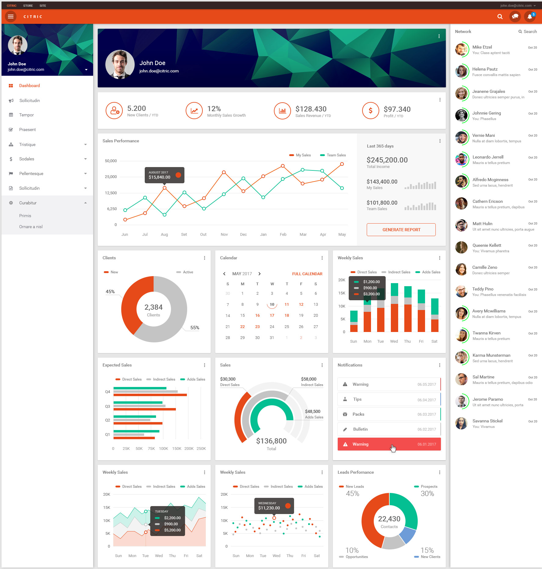
Third: Creation of a card with the last five notifications inside the dashboard.
